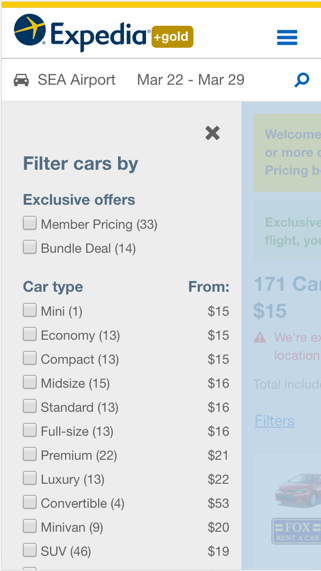
Our filters were originally designed and optimized for a desktop experience. To be a mobile-first business, we actually need to design from a true mobile-first perspective.
Our filtering components are not consistent in behavior, visual design, or placement across the different Expedia product lines. These inconsistencies result in a disjointed user experience that adds cognitive load to those using filters across different product lines.
Our filtering components also lack appropriate interaction feedback. This creates frustration among our users because the pattern seems to be broken.
In addition, the touch targets for the filters are so small that the user ends up interacting with other filters that were not initially intended to get activated.
How do we know it is a user problem?
Over the past several years we have noticed that engagement with our filter components has decreased dramatically.
In-house research identified that our users are not using the filters because they find them confusing and complicated to use.
This is important aspect of the experience to improve because filters give users a sense of control while they shop.
Is this problem worth solving it?
In-house research indicates that users that interact with filters have a higher conversion rate than users who don’t interact with the filters.
By determining a uniform approach to sorting and filtering, we can help users find a product that meets their specific needs quickly and easily.
Have others tried to solve the same problem?
We did an extensive competitive analysis to understand how existing patterns work from the perspectives of interaction design, visual design, and user feedback.
Based on that research, we were able to find out and identify the core elements/pieces that are needed to create a filter pattern.
We were also able to identify areas where we could possibly optimize our filters to create a better experience for our users.
How can we solve it?
Sketches
We were a team of 3 designers. Since we didn’t know how exactly we wanted to tackle the problem, we decided to go wide and sketched a few options on our own. We then came back and noticed patterns within our sketches. Even though each of us sketched something different, we had a few elements that were similar and that each of us accounted for when sketching filter patterns. These elements were:
Incorporating a CTA that triggers the filters
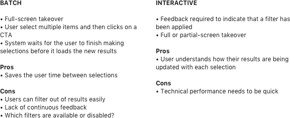
Decide on an interaction model: Batch, Interactive, or Hybrid
Include an additional CTA to apply selected filters
Include a CTA to clear filter selection
Decide on a full or partial screen takeover
Establish feedback for user actions
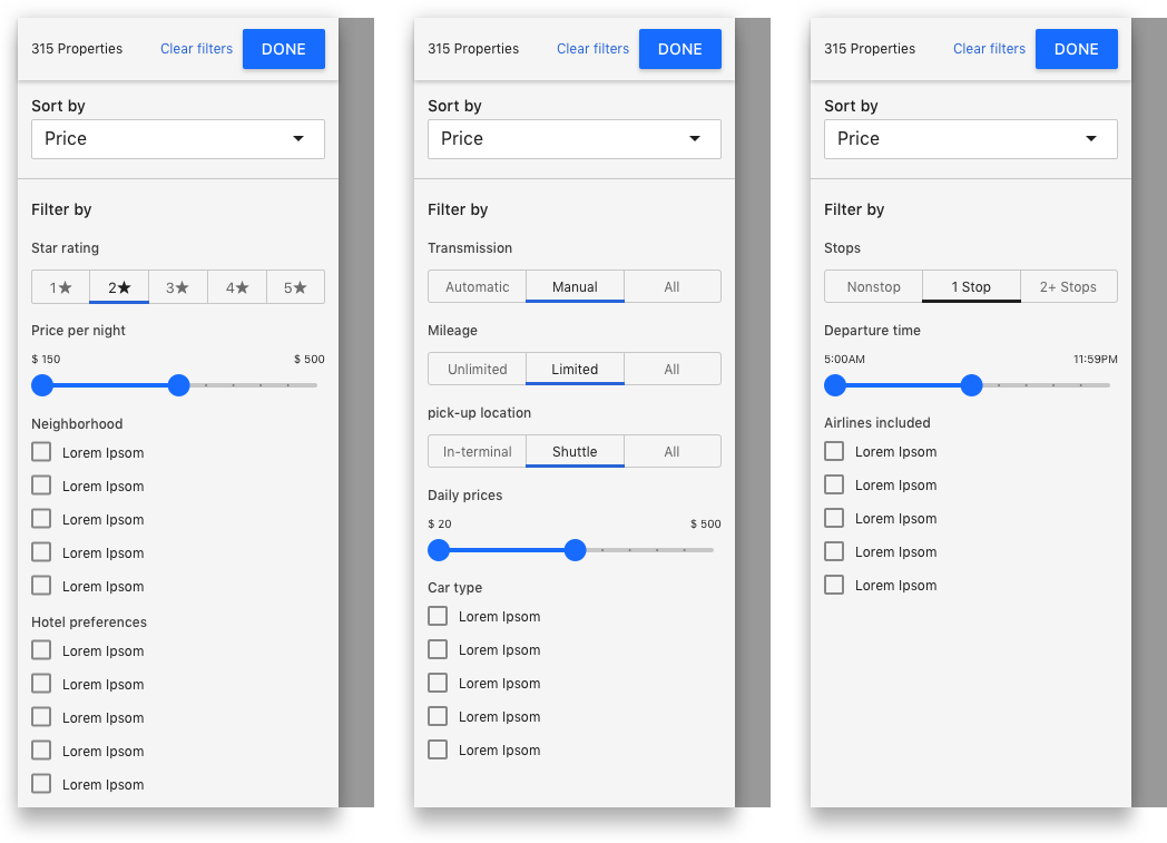
Visual patterns to display filter categories
All controls exposed by default
Panel view of each category
Expand/collapse of each category
Wireframing
We jumped into a higher fidelity tool to understand the trade-offs of each combination and permutation. This exercise happened once we understood the core components of a filter pattern established in our sketches.
There were 4 key areas of the filter design for which we needed to make decisions: Interaction model, view mode, controls, and user feedback. These decisions were important not only because they define the behavior and visual look of the pattern, but because performance is key to the success of a good filter pattern. There isn’t any value in creating something pleasant to see if it is not usable. #wordsofwisdom
Since we have a mobile app, both Android and Apple, we also wanted as much parity as possible for consistency in experiences, so we decided to try to align our designs as much as possible with theirs.
Final Design
As we narrowed our decisions, we jumped into a higher fidelity tool to start polishing the design. We decided to move forward with the one single view with all controls exposed to keep our experience as consistent as possible with our mobile app experience.
Since we were under a time constraint, we decided to launch the new filters without exploring other controls such as icons that are actually buttons. This decision happened because internal teams were ready to implement the new design.
Our next steps
We only explored Mobile breakpoint. We now have to explore Tablet and Desktop experiences and understand how those experiences will blend with the mobile one.
We need to schedule testing in the to learn if our users understand the new pattern and where can we optimize it .
Explore other types of controls such as using icons as buttons.