When a user enters a search query (to find the car they are looking for), we display a list of search results (each one representing a potential car that they can rent).
We currently display a "user review rating" next to each search result, using a happy/sad face. We did not have a good understanding of whether this treatment (for displaying the rating) was helping car shoppers to make their decision, and whether the solution can improved to enable more informed decision making.
Many of our search results had the same "rating" (happy/sad) displayed next to them, and thus the underlying signal was being diluted.
How do we know it is a user problem?
User reviews/ratings are generally important signals when making purchase decisions online (not just car rentals), especially when all other comparison points are the same (car features, terms of contract, etc).
Is this problem worth solving it?
Reviews/ratings help the user's confidence when making a rental decision, and can potentially influence converstion rates.
In addition, helping customers make better choices leads to downstream user satisfaction and customer retention.
The fact that we did not understand whether the ratings treatment was being effective, means that we are potentially leaving revenue on the table.
As an organization, we also did not have a good understanding of how ratings should be presented, and did not have a consistent pattern that can be used across other product lines (hotels, flights, etc).
By exploring potential improvements, we could arrive at a north star design to help inform a future playback pattern, serving all lines of businesses at Expedia.
Have others tried to solve the same problem?
We did an extensive competitive analysis (auditing travel sites, e-commerce sites and car sites - a total of 14) to understand the general conventions around how these patterns generally work.
We aimed to understand which components of each existing solution tackled different parts of the overall user problem, and we looked for opportunities to develop an even better solution.
Through extensive competitive analysis, we also to understand specifically the job that reviews should play at a search result level. This analysis helped us move forward with a clearer picture of what the pattern needed to communicate to the user, thus informing our design explorations.
How can we solve it?
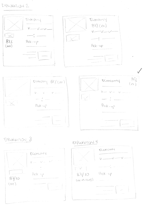
Sketches
From our competitive analysis, we distilled the main patterns predominantly used by existing solutions.
We explored a few sketches to hone down the direction that we wanted to go.
Wireframes
After exploring a few options during the sketching stage, we were able to identify 3 primary patterns and 3 possible placements.
Pattern candidates: Percentage, scale out of 10, and scale plus an icon.
Placement candidates: Top-right corner, next to the car type, and after the car make and model.
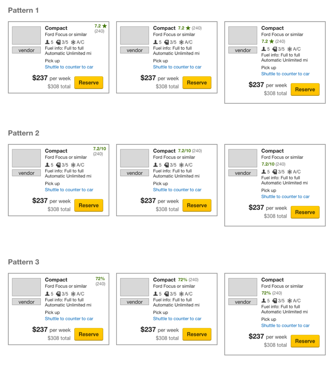
Refined designs
Above, you can see the 4 options that we decided to pursue for testing. Here are the considerations that we evaluated in order to formulate the above solutions...
From a "Pattern" perspective, we identified the following considerations:
Percentage
On it’s own, it’s not understandable as a rating.
Would need to have an icon present as well, in order to be understood as a rating.
Decimal rating with scale
Using a slash, e.g. "7/10", could be confusing especially in the presence of the "2/4 door" icon below.
Would need a visual separation in this case, either an icon or a background color.
Star (or other icon) out of a maximum score of 5
Although it is the most common pattern we saw, and most universally understood as a rating, using 5 star scale can be confused with Hotel star rating.
Two-tone star ratings are not as accessible for users with color blindness.
When not showing all 5 stars/icons, is it understandable that the scale is out of 5?
Stars are easily recognizable as ratings, but not other icons.
Decimal rating
Would need to have the entire scale (out of 10) to be understood.
From a "Placement" perspective, we identified the following considerations:
Inline text treatment with car type
Can require inconsistent placements from one listing to another, as it is dependent on the length of the text.
Placement informs what the rating is about
Placing it below the car type may suggest the review is only about the car itself.
Corner placement may suggest that the review is about the entire experience.
From our competitive analysis, most sites locate rating below the item’s name.
From a visual treatment perspective
Color
Green implies a positive rating.
Dark blue, when used as a background, may have too much contrast and draw too much attention away from the core listing.
Yellow (with a star icon) is most commonly used, as observed in our competitive analysis.
Background color
Greatly increases the prominence of the rating, presenting it as the most important component of the listing.
For scalability reasons, this is risky, as it makes it harder to highlight other components of the listing that may require emphasis in the future.
Changing color (or icon) based on the rating
Introduces sentiment.
We are suggesting what is considered a good or bad rating, instead of letting the user decide.
Draws more attention to this element on the listing.
Have we solved the problem?
We decided to pursue the above 4 solutions for testing.
Conversion rates is the primary metric that we planned to use to determine the success of the solutions. The reason is, as described above, ratings are intended to help car shoppers feel more confident about their rental decisions.
Specifically, we wanted to understand the impact on conversion rates for the Hotels line of business, since star ratings have existing semantics in that industry (and two of the solutions use star ratings). However, the concept of user ratings (denoted with stars) is well understood by the collective of users and used frequently by others in the market. Thus, we wanted to pursue and test these solutions which are closest to the pattern that we believe users expect (in presenting ratings and reviews).
We are also aware that the solution we choose may need future changes as it gets a deeper vetting across all lines of business at Expedia.
Part of the problem will need to be solved in a subsequent iteration. Specifially, the "Details" page (in both the Cars and Hotels) experiences also needs to display ratings. This is also to something that we needed to pay attention to during the testing phase.