Through research, we learned that our users wanted to get more details about the car they were going to rent.
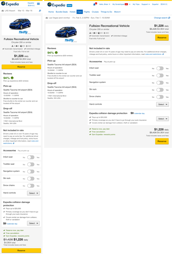
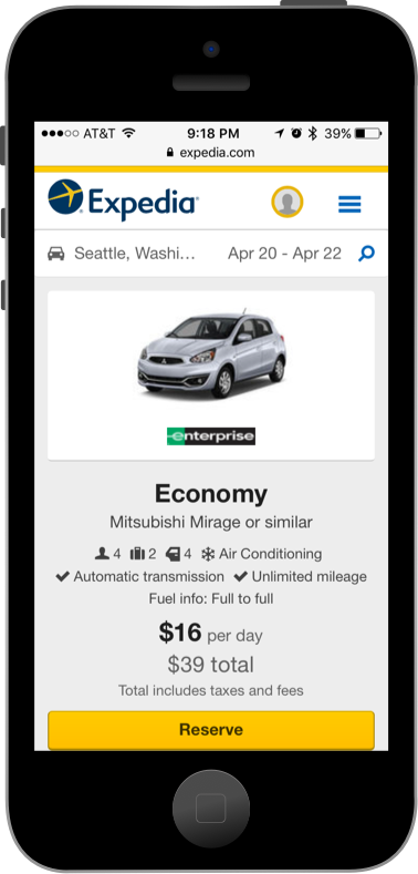
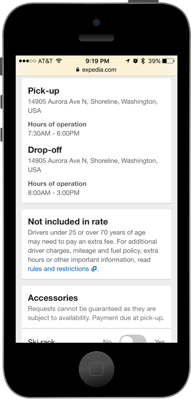
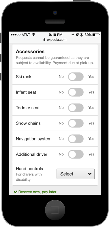
Specifically, users wanted to see: Hours of operation, accessories, rate exclusions and inclusions, reviews, pick-up information and drop-off information.
How do we know it is a user problem?
As a result of not finding the right information, we observed high abandonment rates.
During research sessions, we found that users were better able to make decisions in competitor websites that provided more information.
Is this problem worth solving it?
Abandonment rates constitute customer churn and translate to lost revenue opportunity.
By addressing our customer's needs we could lift conversion rates and increase customer engagement and return rates.
Have others tried to solve the same problem?
We first wanted to see how others in the market were solving a similar problem.
We did an extensive competitive analysis to understand the key components of existing solutions.
How can we solve it?
We first categorized and analyzed the patterns we observed in industry solutions.
This work, in conjunction with the previous user research, helped us formulate the primary user story (articulating the experience and flow that we wanted for our customers).
It also helped identify alternative user stories to consider, and the corresponding alternate page layouts, to then test them out and understand which layout is preferred by customers.
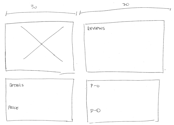
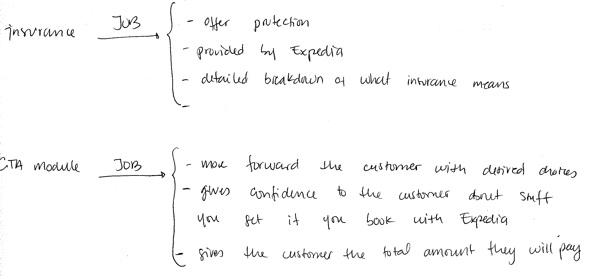
Content inventory
We put together a content inventory, to understand the jobs of each piece of content in the proposed Car Details page. We wanted to have a clear picture of how each component will help me as a customer to make a more informed decision.
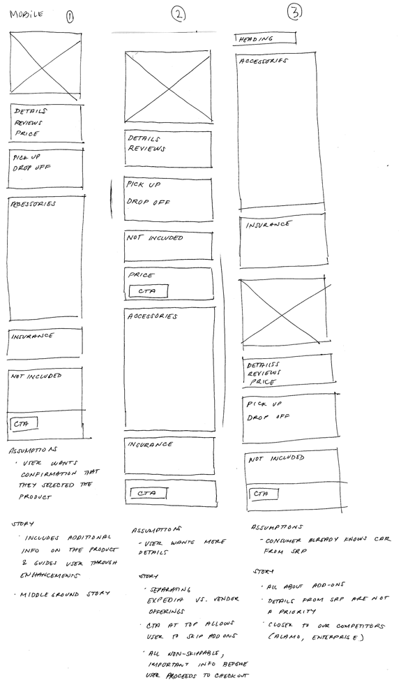
Sketches
We roughly sketched out a few options for the layout. We evaluated the relevant tradeoffs (scalability, the flow of the resulting user story, etc), and narrowed down to the top candidates.
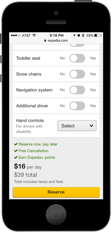
Option 1: This user story quickly provides the user with the additional information they desire. It then guides them towards the "Accessories" module. Towards the bottom of the page, the "Not included in rate" module is shown followed by the main "Call To Action" button.
Option 2: This user story quickly provides the user the information necessary to make a final decision and move forward along the "shopping funnel". Accessories are considered secondary (they rarely lead the user to revisit the choice of car).
Option 3: This user story prioritizes showing the user the set of accessories they can rent. Additional information is presented as secondary.
We made the decision we wanted to move forward with User Story #1.
Wireframing
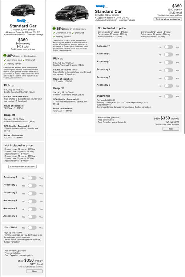
Since we have a responsive framework, we needed to further evaluate how Option 1 would look like in a desktop view.
We also wanted to understand the tradeoffs pertaining to the specifics of our existing pattern library.
We needed to develop a solution that was scalable and suitable for our A/B testing environment. A solution where we'd be able to incorporate future user stories without requiring too much re-work on the engineering side.
We were also looking for a solution that was accessible!
Final Design
Once we decided the direction we wanted to go, we started to polish our mocks with a higher fidelity tool to accomplish our final designs.
We wanted to make sure that the Car Details page was helping to solve our main user problem: Therefore, our higher fidelity mock went through numerous design reviews, iterations on font size, font weight, colors, and background colors.
Have we solved the problem?
We explicitly chose to avoid fixating on the solution having to be truly "final" / having to work forever as designed. It was more important to build a scalable solution, so that we could implement further improvements and changes as we continued to learn and refine the experience.
We came up with a deck of possible future tests, to help us further hone down the real user story that the page should provide.
We were aware that the incremental performance of the page (upon rollout) could be negative, and we wanted to be fully prepared for that possible outcome. By planning possible iterations ahead of time, we also better improved our understanding of the underlying Information Architecture.
We were also aware that the initial launch design was heavy in content. However, since we were coming from a place of showing too little information (and resulting user dissatisfaction), we wanted to go closer to the other end of the spectrum in order to optimize for our own learning. Subsequently, we would be able to dial things back and experiment with removing or reducing specific pieces of content.